Right in my sweet spot, this. Two of my favourite obsessions, food and design, coming delightfully together in this post.
An awful lot of people watch the TV series Masterchef and probably don’t give the logo much thought at all, me included. Television programme branding is often just there to support the actual televised content, which to be honest is how it should be. Great design shouldn’t be conspicuous, it should support and allow the real content to shine and this applies across all disciplines.
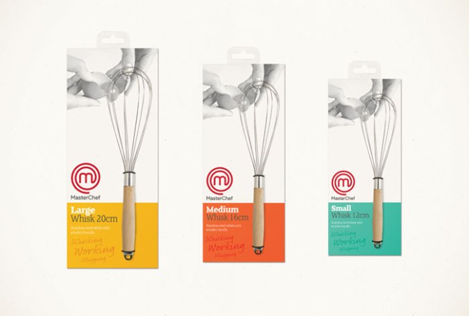
It’s only when we see the Masterchef design out of its TV context that one comes to appreciate the quality of execution and application across a wide range of items. London-based consultancy The Plant has given the brand a bit of a makeover (nothing too radical) as the brand branches out from its televisual roots into retail, events/ online and publications.
I think they’ve done a very tidy job of it too, from the subtle re-draw of the logo to a nice colour palette and onto a sophisticated colour palette and photographic style. Coming, I’m sure, to a store near us all. Very soon.